maven clinic is the next generation of care for women
but Before 2017, Maven looked like any other healthcare startup.
THAT playful sans serif font, primary colors, line weight icons, nothing to indicate that this healthcare app was different from any other healthcare app.

-
lead product designer, partnering with Hanna Danielson as Art Director and Julia Robbs as photographer.
app design, site design, art direction, illustration, packaging, social media. -
Create a full brand redesign, including a new typeface, color palette, and set of brand assets. We needed to stand out in a growing market of women’s health apps.
-
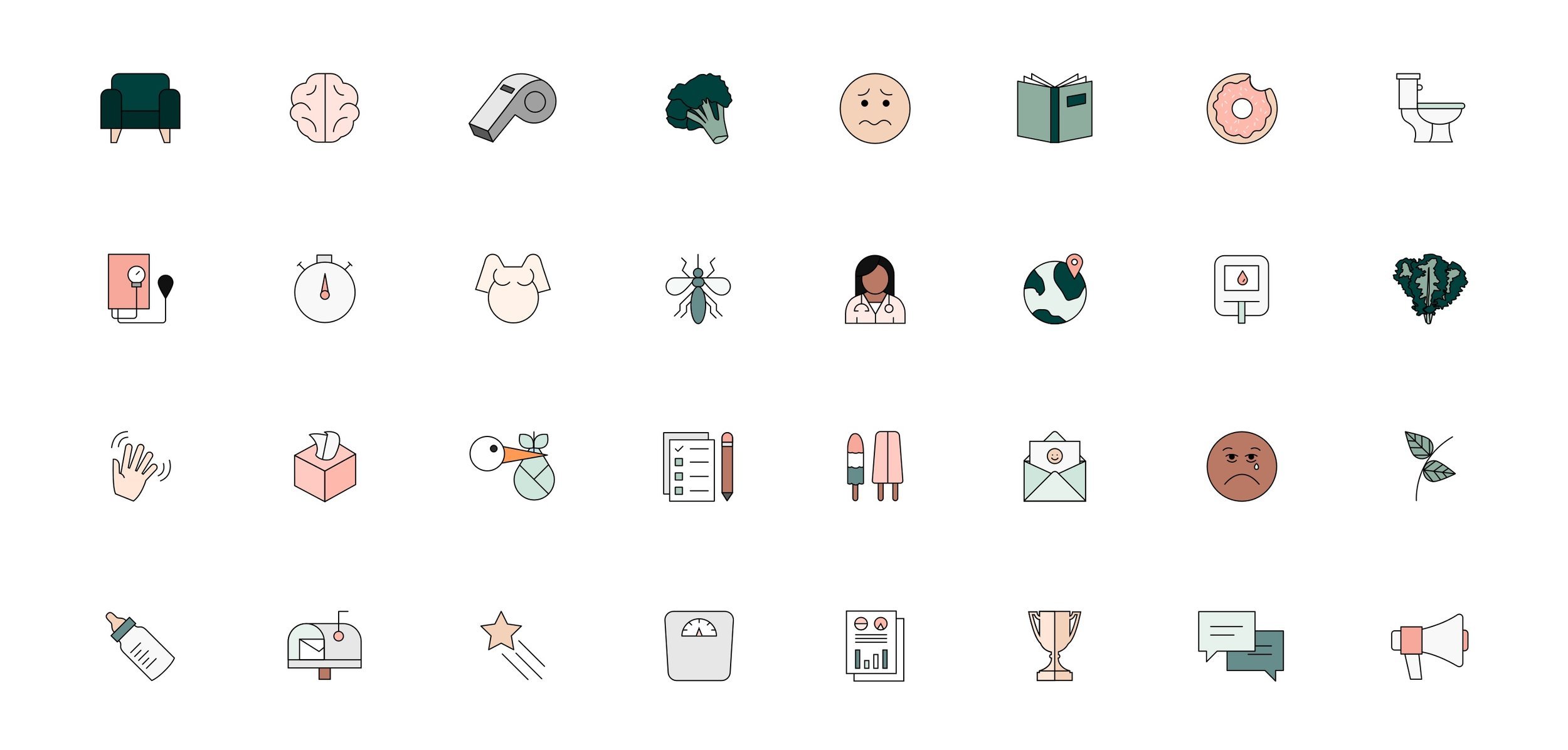
together Hanna and i designed over 500 icons during our joint time at Maven.
Before
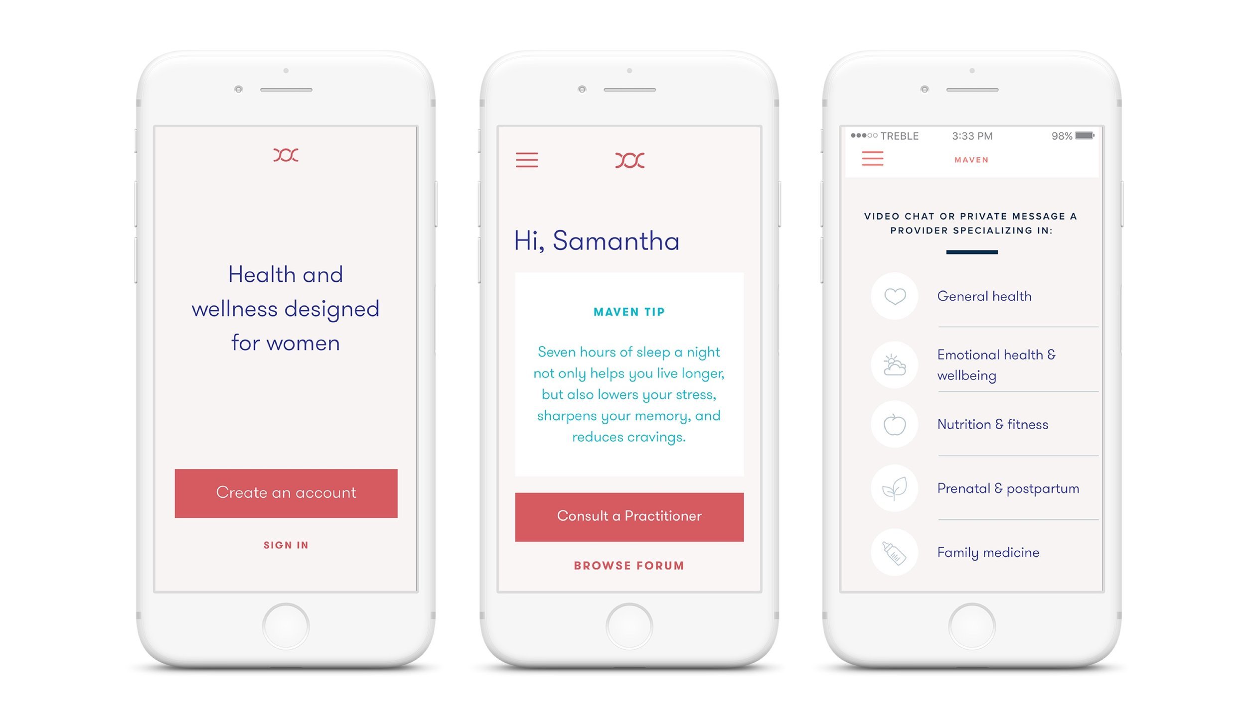
after

We started the project by diagramming out the landscape of existing healthcare apps and found overrepresentation in two ‘themes’; either cold/stark/masculine or bright/floral/traditionally feminine. where was the middle ground of a brand women could trust without pigeonholing them into traditional standards?
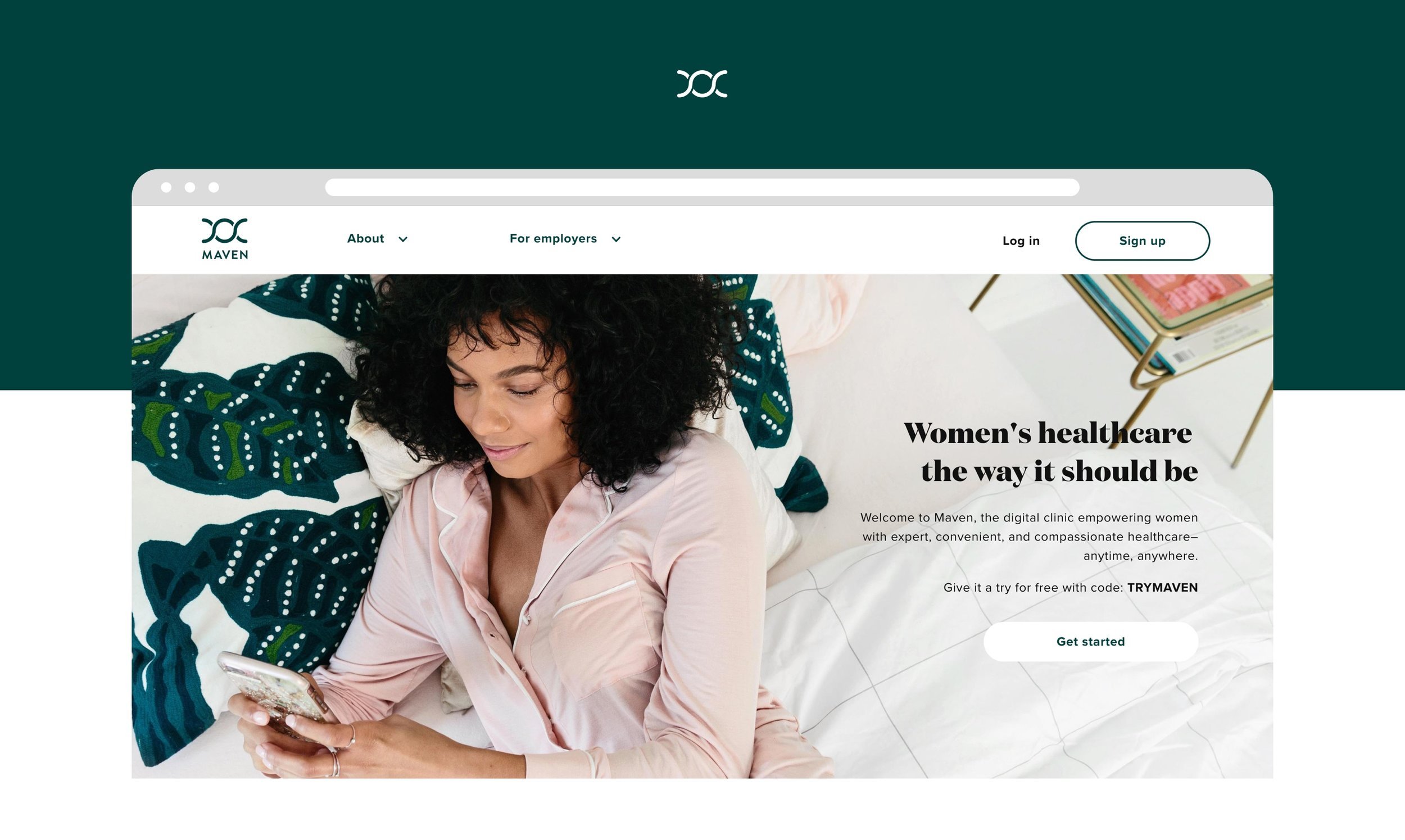
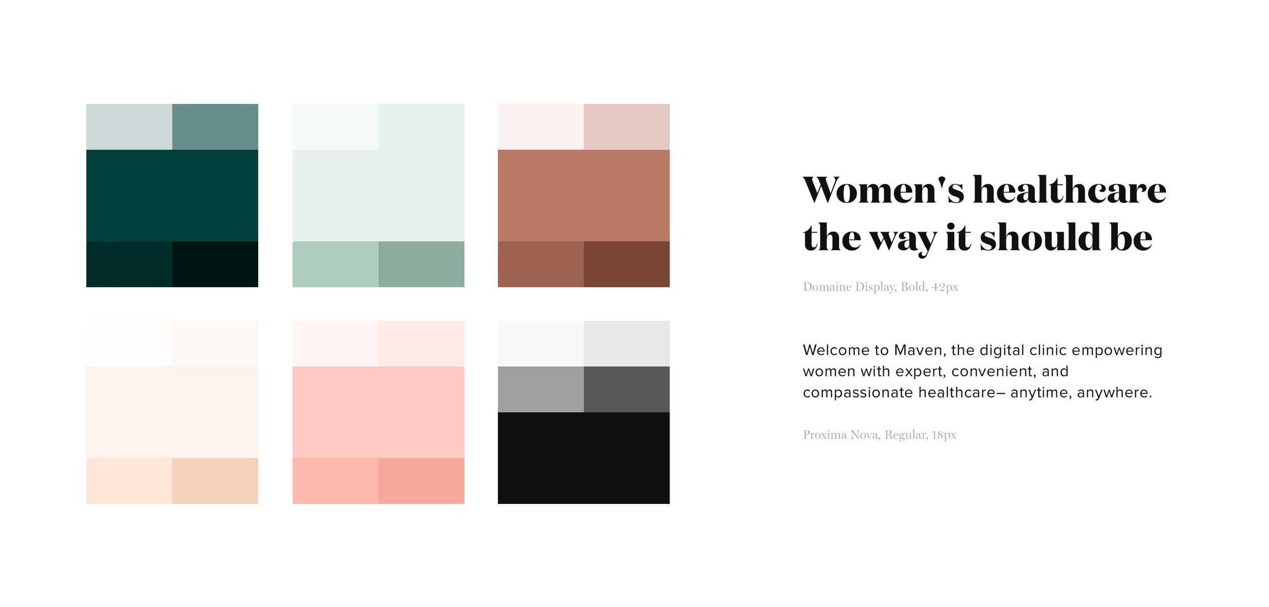
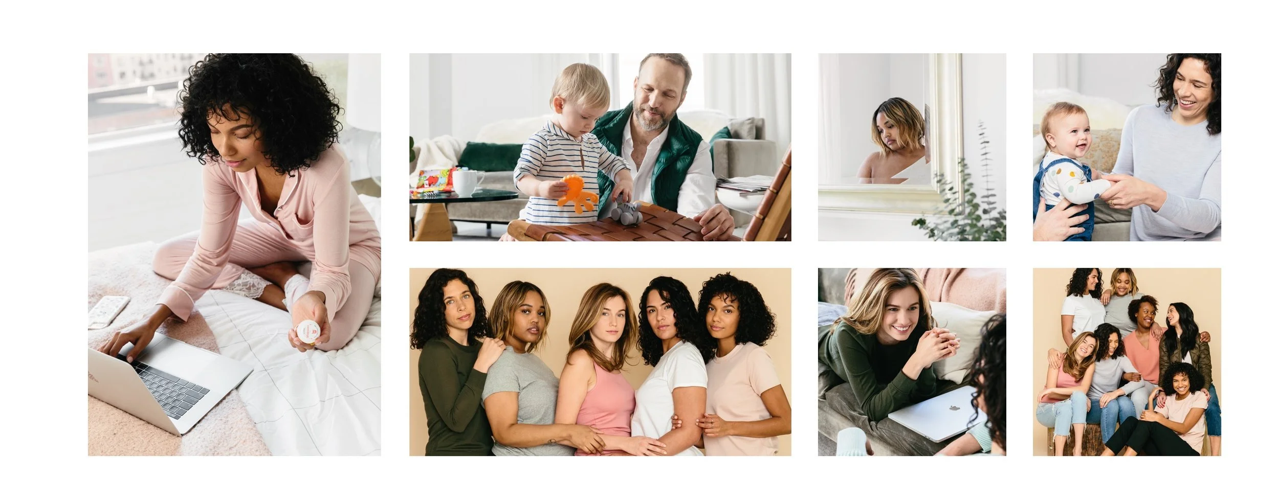
from there we built out a suite of over 500 icons and got to work producing our first set of photos. our goal for maven’s photography was to display a diverse group of people and emotions. our goal for our illustrations was to bring some fun and personality into the app.